Equinox
Members App
Intro
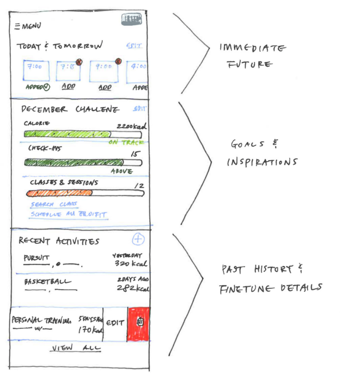
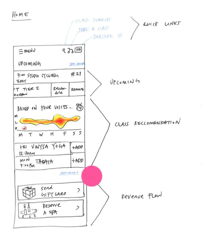
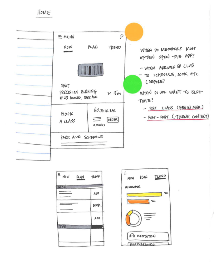
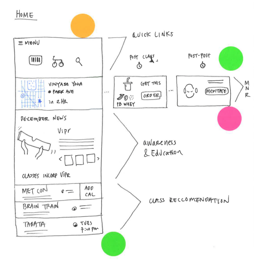
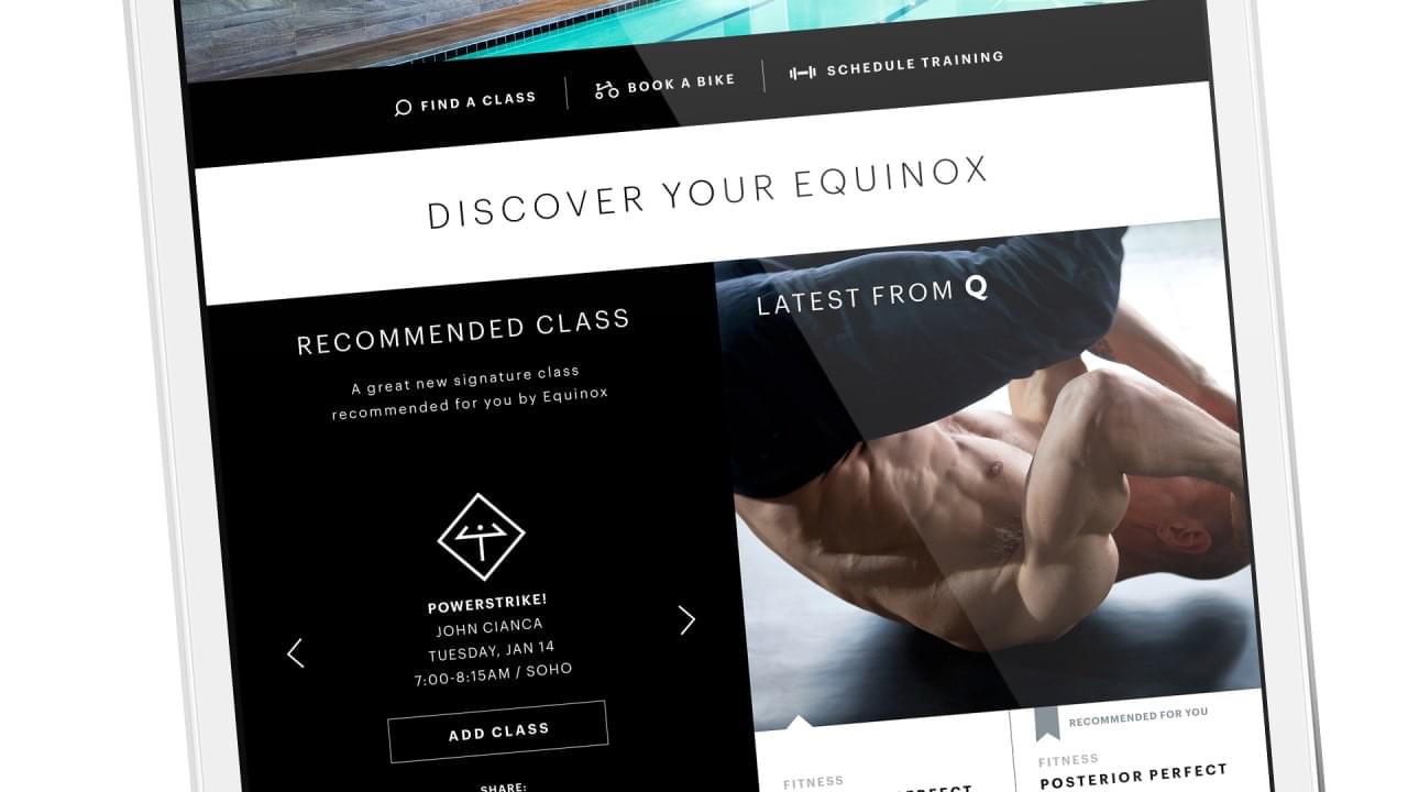
At the end of 2015, we began to redesign the Members iOS app home screen and menu structure. The app rating at the time was 4.5 out of 5 stars, so the challenge was keeping the happy customers happy while satisfying some new business needs. We identified the detailed issues, limitations, and areas for improvement based on our deep understanding of member behaviors and lifestyle.
The goal for the new design was to retain core task-based actions (about 85% of current traffic), while improving review and discovery performance.


Ideas
Many ideas were drawn, reviewed, and drawn more.
